PDF Watermark Settings That Stay Readable in Print
Key takeaways
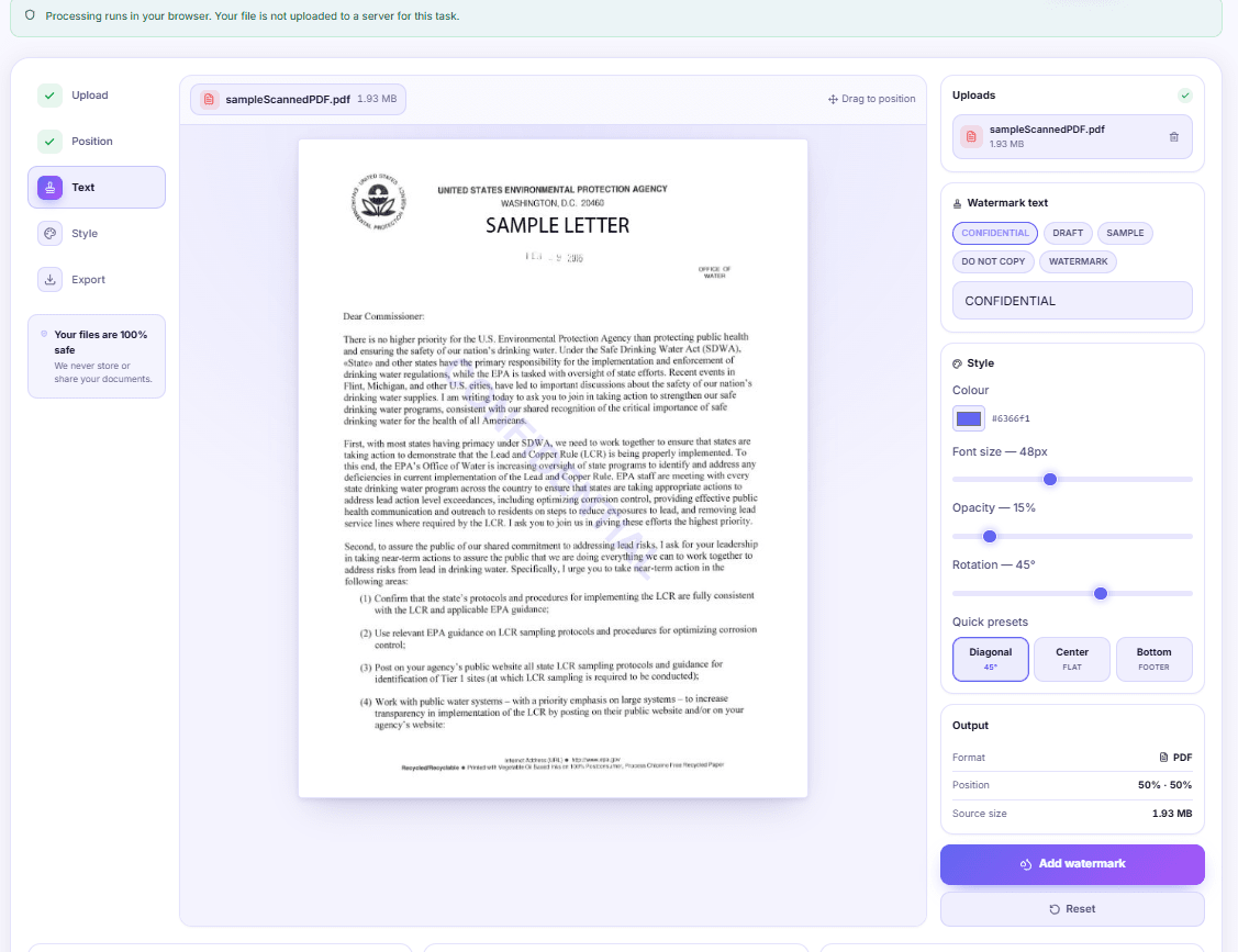
- The tool draws one line of text per page, not a tiled grid
- 15% opacity is a screen setting; print needs 30% or more
- Text does not wrap, so long labels run off the page edge
- Position is stored as a percentage, so it lands the same on every page
The rate table is the one part of a tender bid that has to stay readable, and that is exactly where the CONFIDENTIAL stamp landed — 48 pt, dead centre, straight through the figures for items 14 to 22. The bid was fine. The watermark was fine. Together they were useless.
Stamping a label onto a PDF is easy. Getting one that the eye slides past while the brain still registers it takes four numbers, and the defaults are only correct for one kind of document.
What actually gets drawn on the page
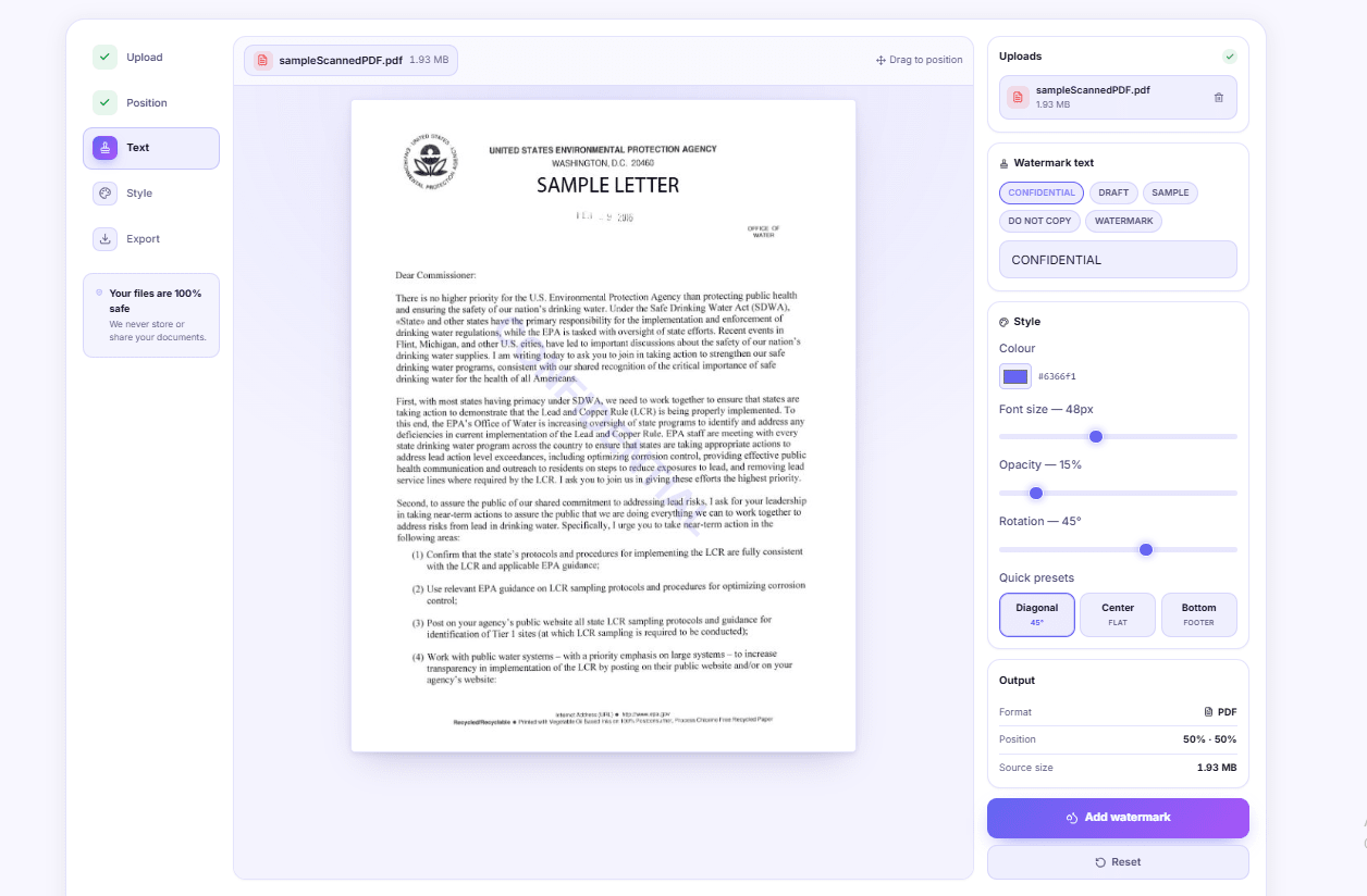
Worth being precise about this, because it decides everything else. The PDF Watermark tool draws your text once per page, in Helvetica Bold, centred on the point you drag it to. Once. It is not a tiled grid of repeated words filling the sheet, and it is not a background image sitting behind your content. One string, one instance, on every page of the file.
The position is stored as a percentage of the page, not as a measurement in millimetres. Drag the word to 50% across and 50% down on page one and it lands in the middle of page eight too, even if page eight is a landscape scan sitting in an otherwise A4 document. That is usually what you want, and it is why there is no per-page control — the tool treats the whole file as one job.
Opacity is the slider that decides everything else
The slider runs from 5% to 80% and opens at 15%. Fifteen percent is a screen number. On a monitor it reads as a soft indigo ghost behind the text. On a laser printer it often comes out as almost nothing, and on a photocopy of that print it disappears completely.
Here is the rough behaviour, worked out the boring way — print one page, photocopy it, look at both:
| Opacity | On screen | Printed on a laser | Survives a photocopy |
|---|---|---|---|
| 5-10% | Barely visible | Effectively invisible | No |
| 15-20% | Clean, unobtrusive | Faint but present | Rarely |
| 25-35% | Clearly a label | Reads well | Usually |
| 40-55% | Dominant | Strong | Yes |
| 60-80% | Fights your content | Blocks text | Yes, and so does nothing else |
If the file will only ever be read on a screen, 15% to 20% is right. If someone will print it and pass the printout around a site office, start at 30%. Above 45% you are not labelling the document any more, you are covering it.
Size: 48 pt looks smaller than you think
The font size slider runs 16 to 96 and starts at 48. On an A4 page — 595 by 842 points — a 48 pt capital is about the height of a large heading. The width is what catches people out.
Helvetica Bold capitals run to roughly 0.72 of the point size in width each. CONFIDENTIAL, twelve characters, is therefore around 415 points wide at 48 pt, which fits across a 595 pt page with room to spare. Push the slider to 96 pt and the same word wants about 830 points, wider than the page. The tool still draws it. The ends simply fall off the edges, and you will not notice unless you look at the preview.
There is no wrapping. The string is drawn as one line, always. That is where longer labels break:
- DRAFT at 96 pt: fine, roughly 350 pt wide.
- NOT FOR CIRCULATION at 60 pt: about 800 pt. Too wide flat, fits on the diagonal.
- STRICTLY CONFIDENTIAL - DO NOT DISTRIBUTE at 48 pt: about 1,400 pt. Off the page at any angle.
If your label is a sentence, drop to 20-28 pt and put it along the bottom rather than across the middle. Or shorten the words, which is usually the better answer anyway.
Angle does more than decorate
Rotation runs from -180° to 180°, and the diagonal preset sets 45°. The diagonal is not only convention. On an A4 page the diagonal measures about 1,030 points against 595 across, so tilting buys you nearly twice the width for a long label.
Flat at 0° is better when the watermark carries something a reader has to actually read — a date, a file reference, a recipient's name. People read horizontal text without effort and skim diagonal text as decoration, which is precisely why status labels look correct on the diagonal and instructions do not.
The three quick presets cover most of it. Diagonal centres the text at 45°, Center flattens it to 0°, and Bottom moves it to 50% across and 90% down, flat, where it behaves like a footer. Bottom is the underused one. A quiet line at the foot of every page — project name, issue date — labels a document without touching a single table.
Position: drag it off the content, not onto it
The preview shows the real first page with the watermark overlaid, and you drag it with a mouse or a finger. Use it properly. Most documents have a natural empty band: the outer margin, the space under a signature block, the gap above a footer. A label sitting there at 35% opacity communicates more than a 15% ghost through the middle of a paragraph, because it is legible without competing.
For a document with a repeating layout — invoices, statements, certificates — page one is representative and dragging on it is enough. For a mixed bundle, open the exported file and check a page from the middle.
Colour, and why the default is indigo
The colour picker opens on #6366f1, a mid indigo. It looks good on a screen. It is a poor choice for anything printed on a mono laser, where colours collapse to grey and a mid indigo lands near 45% grey — heavier than you intended.
For print, pick the grey you actually want (#808080 is a safe middle) or a red like #b91c1c when the label is a genuine warning. For screen-only files, indigo or a slate blue keeps the page calm.
Settings by purpose
| Purpose | Text | Size | Opacity | Angle | Position |
|---|---|---|---|---|---|
| Internal circulation | CONFIDENTIAL | 48 pt | 18% | 45° | Centre |
| Draft for comment | DRAFT | 72 pt | 22% | 45° | Centre |
| Client preview | SAMPLE | 60 pt | 30% | 45° | Centre |
| Printed and photocopied | DO NOT COPY | 54 pt | 35% | 45° | Centre |
| Quiet ownership mark | Firm name | 22 pt | 40% | 0° | Bottom |
| Dated issue label | Issued 24/08/2026 | 20 pt | 45% | 0° | Bottom |
Two things that will stop you
A password-protected file. An encrypted PDF has to be opened before it can be rewritten. If you know the password, strip it first with PDF Unlock and watermark the clean copy.
Non-Latin text. The watermark is drawn in the standard Helvetica Bold built into the PDF format itself, which covers Latin letters, digits and common punctuation. A label typed in Devanagari or Tamil will not export. Write it in English, or turn the label into an image and place it with the PDF Stamp tool, which accepts a PNG of anything you like.
Where a watermark stops being the right tool
If the mark belongs in one specific place on one specific page — an approval in a signature block, a seal in the corner of page one — you want a stamp. The stamp tool lets you drag a mark into position, choose which pages carry it, and add a second one somewhere else entirely. A watermark is deliberately blunt: same text, same spot, every page.
And if you are watermarking because the document must not reach the wrong person, be honest about what you are buying. A visible label is deterrence. It tells an honest reader what the file is and reminds a careless one not to forward it. It is not protection — a faint text watermark can be lifted straight back off, which is exactly what the watermark remover is built to do. For anything that genuinely must stay shut, encrypt it instead.
Before you send it
Open the exported file and look at a page from the middle, not only page one. If the file grew noticeably, run it through the PDF Compressor before it goes to email — a text watermark adds very little, but the export rewrites the whole file and some sources expand on the way through.
If you are assembling several watermarked documents into one pack, watermark each part first and join them afterwards with the PDF Merger. A section that gets replaced next week can then be swapped without redoing the label on everything else. The rest of the document tools sit under PDF tools when you need to split, rotate or number the file after labelling it.
DocsSeva Team
Published on September 21, 2026
Browse all tools
29+ free document tools, no account required.
Browse all toolsMore on watermarks
Watermark ID Copies Before You Hand Them to Anyone
How to write a dated purpose line across a PAN or Aadhaar copy before you share it, which settings survive a photocopy, and what a watermark cannot protect you from.
High-Intent Comparison
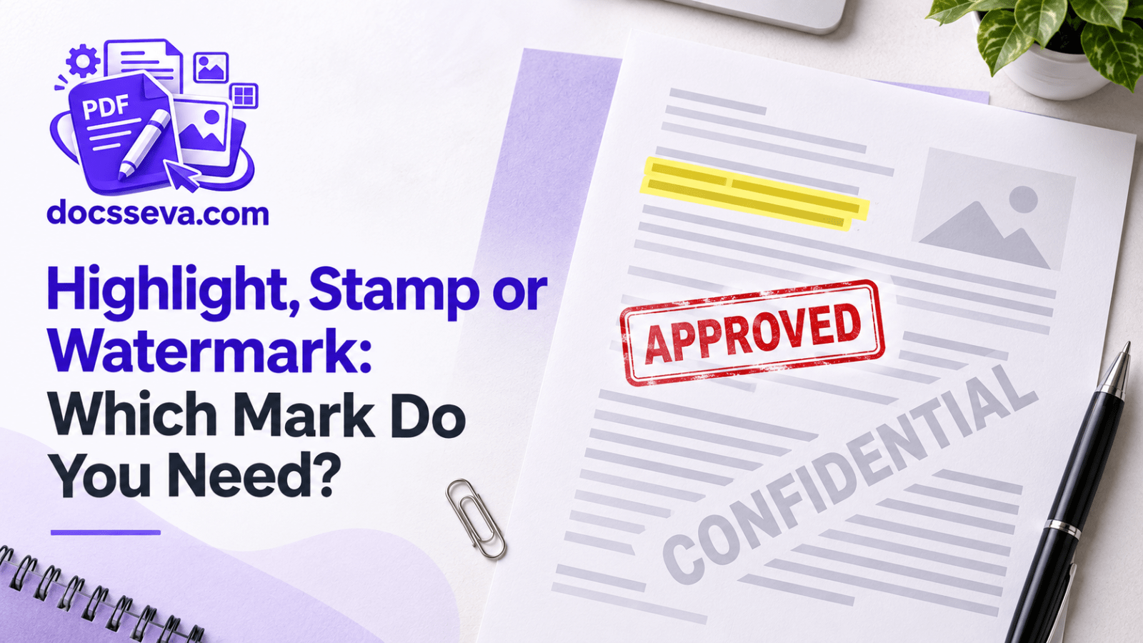
Highlight, Stamp or Watermark: Which Mark Do You Need?
Annotations answer what you think, stamps record what happened, watermarks say what the document is. A side-by-side comparison, including which marks can be undone.
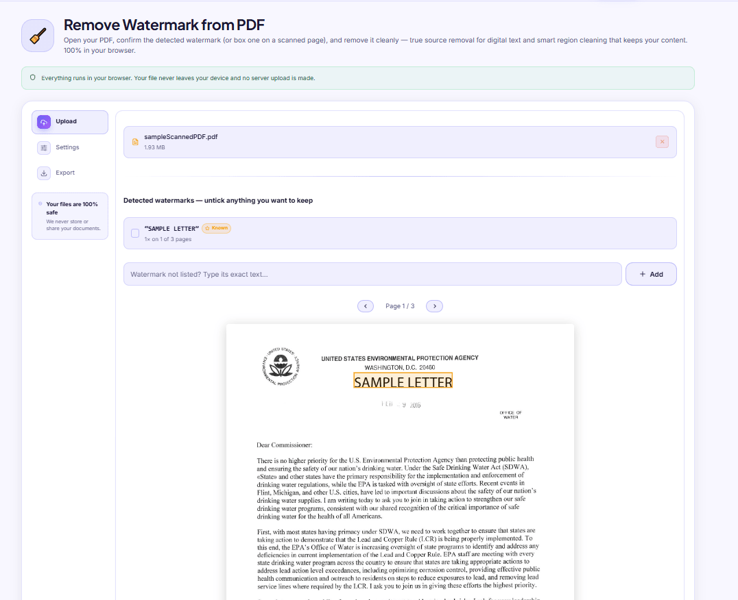
Why Your PDF Text Stops Selecting After Watermark Removal
Watermark removal uses two passes: one deletes the text at the source, the other rebuilds the page as an image. Here is how to tell which one ran on your file.